7 Stunning Wedding Color Palettes for 2025

7 Stunning Wedding Color Palettes for 2025
Wedding color palettes are more than just a backdrop for the big day and they shape the entire mood and memory of a celebration. Most people think picking a color comes down to favorite shades or trending hues. But experts say that even the brightness and softness of a color can completely change how guests feel and remember the event and studies show light colors can actually evoke more positive emotions. This reveals why couples now use color theory to design weddings that tell their own unforgettable story.
Table of Contents
- Understanding Color Theory For Weddings
- Top Trending Colors For 2025 Weddings
- How To Choose The Right Palette For Your Venue
- Popular Color Combinations To Consider
- Seasonal Color Trends For Weddings In 2025
- Incorporating Texture And Patterns With Colors
- Tips For Using Colors In Wedding Décor And Attire
Quick Summary
| Takeaway | Explanation |
|---|---|
| Understand color properties: hue, value, intensity | Knowing these fundamentals helps create visually appealing palettes that resonate emotionally. |
| Choose trends with emotional resonance | Select colors that reflect personal stories and emotions, enhancing the wedding’s overall atmosphere. |
| Consider venue lighting and architecture | Color perception changes based on your venue, affecting how colors appear in your overall design. |
| Incorporate texture for depth | Mixing different textures with colors enhances the visual experience, making your wedding more engaging. |
| Aim for cohesive color coordination across elements | Ensure that all aspects, from attire to décor, tell a harmonious story of your unique wedding journey. |
1: Understanding Color Theory for Weddings
Choosing wedding color palettes isn’t just about picking pretty shades - it’s a nuanced art form that combines emotional psychology, visual harmony, and personal expression. Color theory provides the foundational framework for creating stunning wedding aesthetics that resonate deeply with couples and guests.
According to New Mexico State University’s Extension guide, color has three fundamental properties that wedding planners must understand:
- Hue: The pure color itself (red, blue, green)
- Value/Lightness: How light or dark a color appears
- Intensity/Saturation: The color’s brightness or dullness
These properties interact to create visual experiences that can dramatically transform wedding atmospheres. A sophisticated understanding of color relationships helps couples design palettes that not only look beautiful but also communicate specific emotional narratives.
Color harmonies play a crucial role in wedding design. Designers typically work with several strategic color combinations:
- Monochromatic: Different shades and tints of a single color
- Analogous: Colors adjacent on the color wheel (creating calm, cohesive looks)
- Complementary: Colors opposite each other on the wheel (generating high visual contrast)
Interesting research from the Psychonomic Bulletin & Review reveals systematic color-emotion connections. Light colors typically evoke positive emotions, while red communicates high-energy and empowerment. Blue, green, and white suggest peaceful, low-arousal positive feelings - perfect for creating serene wedding environments.
When selecting wedding color palettes for 2025, couples should consider not just aesthetic preferences but also emotional impact. The right color combination can transform a wedding from a simple event to an unforgettable sensory experience. Understanding these nuanced color theory principles empowers couples to craft visually stunning and emotionally resonant celebrations that truly reflect their unique love story.
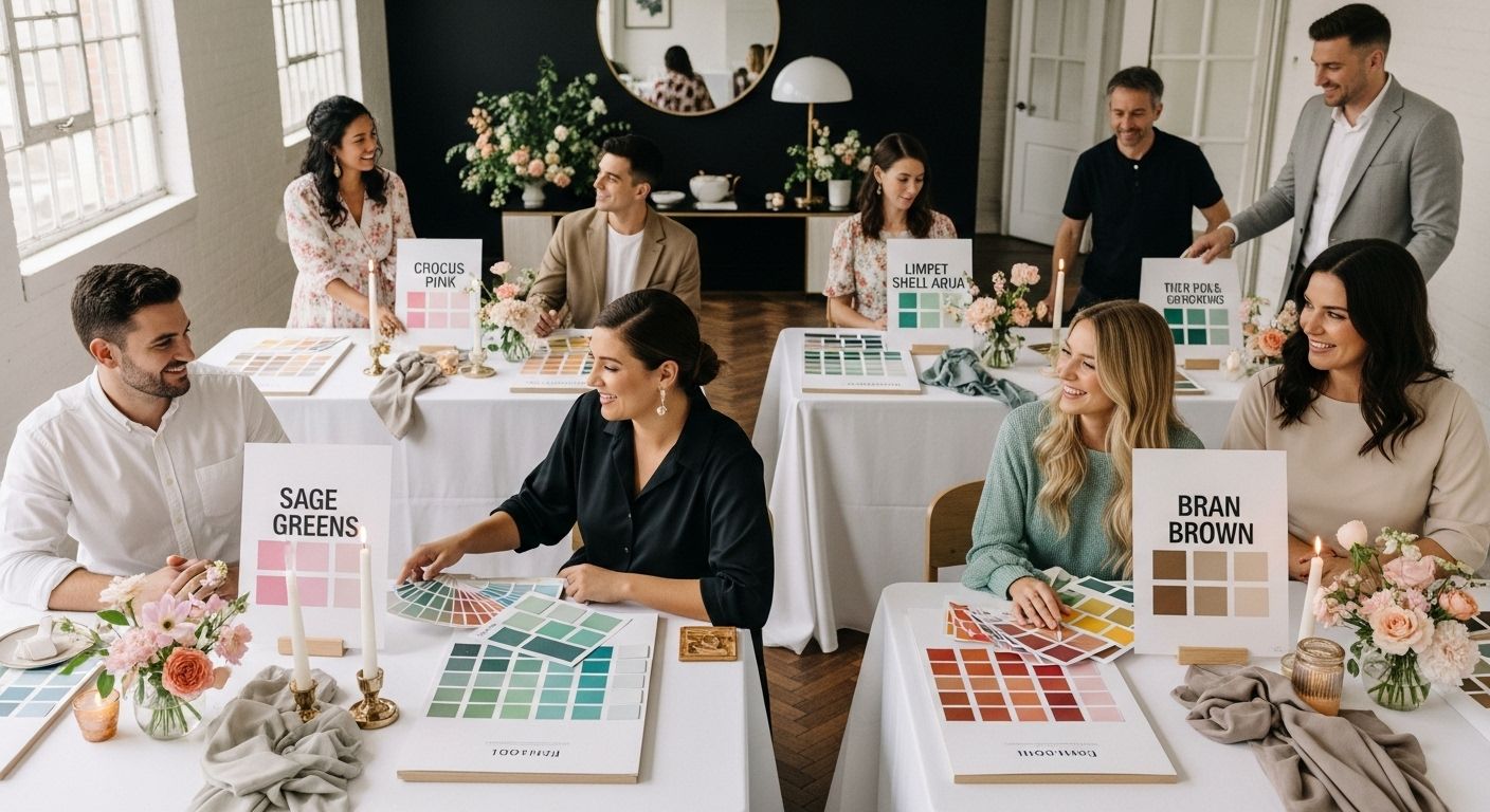
2: Top Trending Colors for 2025 Weddings
The 2025 wedding color landscape promises a fascinating blend of sophisticated neutrals, vibrant statements, and emotionally resonant hues that reflect contemporary design sensibilities. Couples are moving beyond traditional wedding color constraints, embracing more nuanced and personalized palettes that tell their unique love stories.
According to Pantone’s 2025 Color Trend Report, several standout colors are defining the upcoming wedding season:
- Bran: A warm, grounding brown that suggests comfort and stability
- Crocus: A soft pink-purple signaling romance and elegance
- Lime Cream: A gentle green representing renewal and growth
- Limpet Shell: An aqua tone that evokes tranquility and possibility
These colors represent more than aesthetic choices - they are emotional statements. Warm browns communicate groundedness, while soft purples suggest romantic sophistication. Gentle greens symbolize new beginnings, perfectly aligned with the transformative nature of wedding celebrations.
Emerging wedding color trends for 2025 demonstrate a strategic shift towards colors that blend emotional depth with visual complexity. Neutrals are becoming increasingly nuanced, moving away from stark whites and beiges to more complex, layered tones. Soft, muted colors with depth and character are replacing traditionally flat color schemes.
Interesting color combinations are gaining popularity. Think unexpected pairings like muted marigold with deep blue, or coral accents against soft green backgrounds. These innovative palettes allow couples to express their personalities more dynamically, moving beyond conventional wedding color expectations.
For couples planning 2025 weddings, the key is personalization and emotional resonance. The most compelling wedding color palettes will be those that authentically reflect the couple’s unique journey, combining trending hues with deeply personal meaning.
3: How to Choose the Right Palette for Your Venue
Selecting the perfect wedding color palette requires more than aesthetic preferences - it demands a strategic understanding of how colors interact with venue architecture, lighting, and spatial dynamics. Venue selection profoundly influences color perception, making it critical to choose colors that harmonize with your specific environment.
According to the U.S. Department of Energy’s lighting research, several key factors dramatically impact color appearance:
- Color Temperature: Warm lighting (2700-3600K) enhances skin tones
- Color Rendition Index (CRI): Indicates how accurately colors appear
- Surface Reflectance: How different surfaces absorb or reflect light
Venue architecture plays a significant role in color selection. Rustic barn venues with wooden surfaces require different color strategies compared to modern industrial spaces or elegant ballrooms. Dark wooden surfaces absorb light differently than white marble walls, which means your chosen palette will look remarkably different depending on the venue’s inherent characteristics.
When evaluating color palettes, couples should consider the venue’s fundamental visual elements:
- Natural light availability
- Wall and floor color tones
- Existing architectural details
- Potential lighting configurations
Photographic considerations are equally important. Colors that look stunning in person might photograph differently, so couples should request venue lighting samples and conduct color tests beforehand. Some venues offer mock-up sessions where you can preview how your chosen colors will appear under actual event lighting.
Most successful wedding color palettes create a delicate balance between the venue’s existing aesthetic and the couple’s personal style. This means being flexible and willing to adapt your initial color vision to complement the venue’s unique characteristics. A thoughtful approach transforms color selection from a simple design choice into a nuanced artistic expression of your wedding’s emotional landscape.
4: Popular Color Combinations to Consider
Wedding color combinations in 2025 are moving beyond traditional pairings, embracing sophisticated and emotionally nuanced palettes that tell a deeper narrative. Modern couples are seeking color stories that reflect their unique relationship, rather than settling for predictable color schemes.
According to research in color psychology, certain color combinations consistently demonstrate higher aesthetic appeal and emotional resonance:
- Analogous Blues: Soft cornflower, dusty navy, and sky blue
- Earthy Neutrals: Warm browns, sage green, and cream
- Sunset Tones: Coral, peach, and muted gold
Soft, desaturated palettes are emerging as top trends, offering a more sophisticated approach to wedding color selection. These combinations create visual harmony while providing enough contrast to remain interesting. The key is finding colors that complement each other without competing for attention.
Couples are increasingly drawn to color combinations that tell a story. For instance, a palette inspired by a shared travel memory or a meaningful landscape can transform wedding colors from mere decoration to a deeply personal expression. Thoughtful color selection becomes a form of intimate storytelling.
Some standout color combinations for 2025 include:
- Mocha brown with dusty blue and soft pink
- Sage green with warm cream and terracotta
- Soft lavender with pale gold and dove gray
Texture plays a crucial role in these color combinations. Mixing matte and metallic finishes, or incorporating different fabric textures, can add depth and sophistication to your chosen palette. A velvet bridesmaid dress in sage green paired with silk table runners in cream creates a rich, multidimensional visual experience.
The most successful wedding color palettes balance personal meaning with contemporary design sensibilities. They are not just about looking beautiful, but about creating a memorable sensory experience that reflects the couple’s unique journey and aesthetic vision.
5: Seasonal Color Trends for Weddings in 2025
Wedding color trends are not static - they breathe and evolve with the changing seasons, creating unique atmospheric experiences that reflect nature’s transformative beauty. Understanding seasonal color palettes allows couples to design weddings that resonate with the specific emotional landscape of their chosen time of year.
According to Pantone’s Fashion Color Trend Report, seasonal wedding color trends for 2025 present a nuanced approach to color selection:
- Spring Palette: Soft greens, aqua, and delicate pink-purples
- Summer Palette: Vibrant oranges, warm neutrals, and bright accent colors
- Autumn Palette: Deep browns, rich burgundies, and earthy olive tones
- Winter Palette: Cool blues, icy whites, and metallic silver accents
Spring weddings invite soft, regenerative color stories. Think gentle lime cream, limpet shell aqua, and crocus pink - colors that capture the essence of new beginnings and delicate growth. These palettes mirror the season’s themes of renewal and possibility.
Summer weddings offer more bold and energetic color combinations. Bright orangeade and warm cocoon beige create dynamic, celebratory atmospheres that reflect the season’s vibrant spirit. Couples can incorporate these colors through florals, bridesmaid dresses, and reception decor.
Autumn weddings embrace rich, grounding color narratives. Deep bran browns, damson purples, and chili oil reds create warm, intimate environments that feel simultaneously sophisticated and nostalgic. Check out our elegant dress collection for inspiration on incorporating these seasonal tones.
Winter weddings allow for dramatically elegant color expressions. Cool blues, icy whites, and metallic accents transform venues into enchanted, almost ethereal spaces. The key is balancing cool tones with warm undertones to prevent the palette from feeling sterile.
Remember, these seasonal palettes are guidelines, not strict rules. The most memorable wedding colors are those that authentically reflect the couple’s unique story, seamlessly blending seasonal inspiration with personal meaning.
6: Incorporating Texture and Patterns with Colors
Texture transforms color from a visual element into a multisensory experience, elevating wedding design from simple color selection to a rich, immersive narrative. The interplay between color and texture creates depth, intrigue, and emotional resonance that static color palettes cannot achieve.
According to research on visual perception, strategic texture integration requires careful consideration of contrast and visual harmony. Couples should approach texture as deliberately as they select their color palette:
- Soft Textures: Silk, chiffon, velvet
- Structured Textures: Brocade, tweed, raw linen
- Metallic Textures: Satin, sequined fabrics, metallic threads
Fabric textures dramatically influence color perception. A sage green silk will appear entirely different from the same shade in a matte cotton or a shimmering satin. This nuanced approach allows couples to create multidimensional color experiences that feel both sophisticated and deeply personal.
When incorporating patterns, subtlety is key. Oversized floral prints, delicate watercolor-inspired patterns, and geometric minimalist designs can add visual interest without overwhelming the color narrative. Think soft watercolor table runners in muted blues, or delicate gold geometric patterns on cream backgrounds.
Photographic considerations are crucial. Explore our designer dress collection to see how texture can transform a color’s appearance in wedding photography. Certain textures can create stunning light interactions - sequins that catch light, velvet that absorbs color differently, silk that shifts subtly with movement.
Texture recommendations for 2025 wedding palettes include:
- Combining matte and metallic surfaces
- Layering different fabric weights
- Mixing natural and synthetic textures
The most memorable weddings tell a story through their design choices. Texture becomes the narrative thread that connects colors, transforming them from mere visual elements into a rich, emotional experience that reflects the couple’s unique journey.
7: Tips for Using Colors in Wedding Décor and Attire
Wedding color design is an art of strategic visual storytelling, where every element from bridesmaid dresses to table linens contributes to a cohesive emotional narrative. Transforming color selections from theoretical concepts into tangible design requires thoughtful, intentional implementation across multiple wedding elements.
According to CDC research on color and temperature, strategic color choices can impact guest comfort and experience:
- Light Colors: Reflect heat, ideal for outdoor summer weddings
- Dark Colors: Absorb more heat, better suited for indoor or evening events
- Neutral Tones: Provide versatile, temperature-neutral options
Attire color coordination demands nuanced approach. Bridesmaids’ dresses should complement each other without being identical, creating visual harmony through carefully selected color variations. Consider ombré effects, where dresses transition through similar color tones, or mix complementary shades within a defined palette.
Decor color implementation requires strategic layering. Tablescapes become canvases for color storytelling, incorporating:
- Textured table runners
- Complementary napkin colors
- Subtle metallic accent pieces
- Floral centerpieces that echo the chosen palette
Explore our designer dress collection for inspiration on integrating color through fabric and design. Remember that lighting dramatically transforms color perception - what looks perfect in daylight might appear entirely different under evening venue lighting.
Photographic considerations are paramount. Choose colors that photograph well, avoiding extremely saturated tones that might create unflattering color casts. Soft, muted colors typically translate more elegantly in wedding photography, preserving the nuanced emotional tone of your celebration.
The most memorable weddings tell a color story that feels both intentional and effortless. Color becomes more than decoration - it’s a language of emotion, communicating the couple’s unique journey through carefully curated visual experiences.
Below is a comprehensive table summarizing the key themes, steps, and insights from the article to help you understand how to create stunning wedding color palettes for 2025.
| Section/Topic | Key Insights and Takeaways | How It Impacts Your Wedding |
|---|---|---|
| Understanding Color Theory | Color properties (hue, value, intensity) shape mood and emotion; color harmonies set overall tone | Enables emotionally resonant and visually harmonious events |
| Trending Colors for 2025 | Bran, Crocus, Lime Cream, and Limpet Shell are top hues tied to emotional storytelling and personalization | Lets couples move beyond tradition and create unique palettes |
| Matching Palette to Venue | Venue lighting, architecture, and color temperature dramatically influence color perception | Selecting harmonizing colors makes design feel cohesive |
| Popular Combinations | Earthy neutrals, analogous blues, and sunset tones dominate trends; story-driven palettes recommended | Combines visual harmony and personal narrative |
| Seasonal Trends | Spring: pastels; Summer: vibrant oranges; Autumn: rich earth tones; Winter: cool blues/metallics | Seasonal palette choice aligns with atmosphere and time of year |
| Texture & Patterns | Mixing soft, structured, and metallic textures enhances color depth; subtle patterns add interest | Adds richness and dimension to the color story |
| Decor & Attire Application | Light vs. dark colors affect comfort; coordinated attire, strategic layering, and fabric variation matter | Realizes cohesive color story in every wedding detail |
Bring Your Dream Wedding Color Palette to Life with the Perfect Dress
You know choosing the right wedding color palette is not just about style. It is about emotion, harmony, and making memories that last. The article explored how venue, texture, and personalized touches can make or break your vision. The real challenge is translating these beautiful colors and design concepts into a wedding look that feels uniquely yours.
Your dress should be the centerpiece of your color story. Whether you are inspired by trending hues like sage green, bran brown, or crocus, our designer dress collection has options that bring your palette to life in every fabric and finish.
Ready to turn your wedding vision into reality? Visit Dress Me Up NY and find the gown that finally matches your dream palette. Explore the styles, take advantage of exclusive offers, and let your colors shine. Start planning the most unforgettable look for your 2025 wedding today.
Frequently Asked Questions
What are the top trending colors for weddings in 2025?
The top trending colors for 2025 weddings include Bran, Crocus, Lime Cream, and Limpet Shell, which are characteristically warm or pastel tones that convey emotional resonance and personal significance.
How can venue architecture affect my wedding color palette?
Venue architecture impacts color perception significantly; different architectural elements, lighting conditions, and existing colors in the space can alter how your chosen palette looks and feels, making it essential to select colors that harmonize with your venue.
What are some popular color combinations for weddings in 2025?
Popular color combinations for 2025 weddings include earthy neutrals like warm browns with sage green and cream, sunset tones like coral with peach, and soft lavender paired with pale gold. These combinations create visual harmony and tell a story.
How can I incorporate texture into my wedding color scheme?
Incorporating texture involves mixing materials like silk, chiffon, and velvet, along with structured fabrics like brocade. Layering different textures and choosing fabrics with varying finishes can enhance color complexity and make your wedding decor more visually interesting.
Recommended
- Terani Couture 251P4500 Tulle Off-Shoulder Straps Ballgown
- Terani Couture 1811GL6436 Deep V-neck Long-sleeve Dress
- Clarisse 810413 Plunging V-neck Sequin Stretchy Prom Dress
- Tarik Ediz 54155 Taffeta Strapless Sweetheart Mini Dress